Co-authored by Samar Abdelsayed.
It’s very exciting that BlackBerry 10.3.1 Gold has been released along with Momentics 2.1.1. A few weeks ago, we hosted a webcast “Building for BlackBerry Classic” to introduce the new exciting features of the BlackBerry 10.3.1 OS and how to get you started on the BlackBerry Classic development. You’ve missed the webcast? Not to worry, a summary of the webcast has been ready posted here for those who missed the live session. We also have plans to post a series of blog posts over the next few weeks with code snippets and references to useful resources to help you bring your app to BlackBerry Classic. So we’ve got you covered.
While basic support for the newly introduced trackpad comes by default as Cascades selects the first focusable control for you, the BlackBerry 10.3.1 native SDK also includes new API’s that allow you to customize the response of your app to trackpad events, so that you can leverage the new trackpad features into your awesome app effortlessly.
In other words, you can change the default behaviour to suit your app’s need as Cascades enables you to customize the default behavior of trackpad navigation by:
- Setting which control gets focus initially,
- Customizing the navigation path, and
- Changing the highlight style.
In this blog, I would like to focus on the third option and to “Highlight” how to achieve the custom highlighting for your custom controls. The standard Cascades controls in your app should follow the focus highlight effect Cascades provides and using the standard controls as much as possible would be ideal for making focus and touchpad highlighting simpler. However, if your app is using custom controls like (e.g. CustomListItem), the default highlight behavior might not be suitable visually and functionally. That’s when you can apply the custom highlighting technique described in this blog to those cases.
Follow the steps below when you need to use custom highlighting on your custom controls:
- Set your control’s navigation property’s focusPolicy to NavigationFocusPolicy.Focusable.
- Set your control’s navigation property’s defaultHighlightEnabledto false.
- Handle the control’s navigation property’s wantsHighlightChangedsignal by writing a onWantsHighlightChanged() handler in QML. For the cases when the control loses focus, you can use the UIPaletteclass to figure out the appropriate colours.
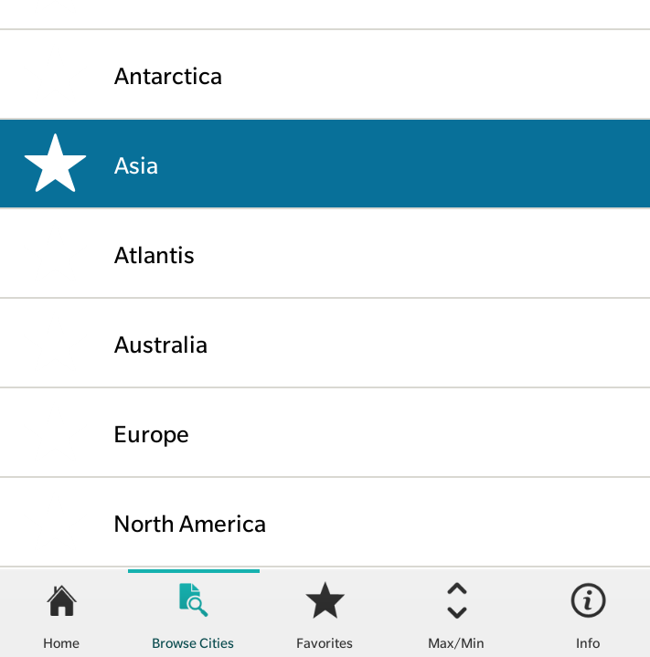
Let’s look at the steps in code. The following code example is taken from the WeatherGuesser sample app and modified to apply custom highlighting. It is part of creating a CustomListItem, which consists of an image/icon and text component displaying a list of continents. When a list item receives focus while moving the trackpad, the focused item changes its background colour to Storm Blue and displays image/icon next to the selected text. The text colour also changes from black to white indicating the item is in focus.
Here is the code snippet that shows how to achieve custom highlighting for a CustomListItem.
import bb.cascades 1.4

CustomListItem {
    property string title
    dividerVisible: true
    id: listItemRoot

    Container {
        id: contentContainer
        leftPadding: ui.du(2)
        rightPadding: ui.du(2)

        layout: StackLayout {
            orientation: LayoutOrientation.LeftToRight
        }

        verticalAlignment: VerticalAlignment.Fill
        horizontalAlignment: HorizontalAlignment.Fill

        // Allows the root container to be able to receive focus
        navigation.focusPolicy: NavigationFocusPolicy.Focusable
        // Disable the default highlight
        navigation.defaultHighlightEnabled:false
        // Change the ListItem’s background color to Storm Blue when receives focus
        background: navigation.wantsHighlight ?
Color.create("#087099") : ui.palette.background

        ImageView {
                id: imageViewID
                imageSource: "asset:///images/icons/ic_favorite.png"
                verticalAlignment: VerticalAlignment.Center
                scalingMethod: ScalingMethod.AspectFit
        }

        // Title.
        Label {
            text: title
            verticalAlignment: VerticalAlignment.Center
            textStyle {
                base: SystemDefaults.TextStyles.PrimaryText
                color: contentContainer.navigation.wantsHighlight? Color.White : Color.Black
            }
        }

        // Divider.
        Container {
            horizontalAlignment: HorizontalAlignment.Fill
            verticalAlignment: VerticalAlignment.Bottom
            background: ui.palette.primaryBase
            minHeight: ui.du(0.1)
        }
    }
}
Check out the screen below for the code in action.
You can also find more details on the custom highlighting on our developer website. Finally, to learn more about Classic development, please visit the article, “That’s so classic“.
That’s all. Stay tuned for our next blog!