In my Sept blog post announcing the 10.3.1 Beta, I emphasized that one of the key objectives of the 10.3.1 release was to provide you with the APIs and tools to bring your app to BlackBerry Classic with minimal hassle. In that post I talked about some of the new APIs and shed light on some aspects of classic development. We also held a webinar a few weeks ago which some of you might have attended where we talked about the things you need to do as a developer to port your app from one of the existing BlackBerry 10 devices to the yet unreleased BlackBerry Classic. Many of you may not have had a chance to attend, which is why I want to provide a summary of the kinds of things you would need to consider as a developer when bringing your app to BlackBerry Classic. This is especially pertinent now that we have just released 10.3.1 Gold along with Momentics 2.1.1.
Getting Started
To start developing for BlackBerry Classic, the first thing you need to do is download Momentics 2.1.1 from our developer site. Once you have downloaded it you can pull in the 10.3.1 API and simulator. You will need to set your API Level to 10.3.1 in order to use the trackpad specific APIs. Since we haven’t released a BlackBerry Classic device as yet you will need to use the simulator for development and testing.
Using Design Units to Optimize for BlackBerry Classic
Once you are setup with the 10.3.1 API and tools, you can get to work on testing and porting you your app. Here are some tips on the kinds of things you should be mindful off when designing your app in order to minimize any extra work when porting to BlackBerry Classic. First you need to make sure your app is resolution agnostic. There are several things you can do to make your application scale well across multiple resolutions. When you lay out your controls, use relative layouts like stack, dock and grid in your app as opposed to absolute layouts. While relative layouts assist with the challenge of aligning controls on a screen, it does not address the issue of dealing with pixel size. This is where design units come into play. Design units are an abstraction introduced in 10.3 that allow you to specify dimensions (such as the length of a control or margin width) in a pixel independent manner. The framework converts the design units to a pixel value that’s optimal for the screen density of that device. As an example the Z10 has 10 pixels per design unit while the Z30 whose display is physically larger than the Z10 has 8 pixels per design unit.
While relative layouts and design units help in making your app resolution independent and screen density independent you will still encounter issues due to aspect ratio. For instance the BlackBerry Classic (like the Q10) has a square display while the Z10 has a rectangular display. A UI that is designed for a rectangular display will likely not look right on a square screen. To illustrate this concept I compiled and ran the Dictaphone sample on a Z10 and a BlackBerry Classic.
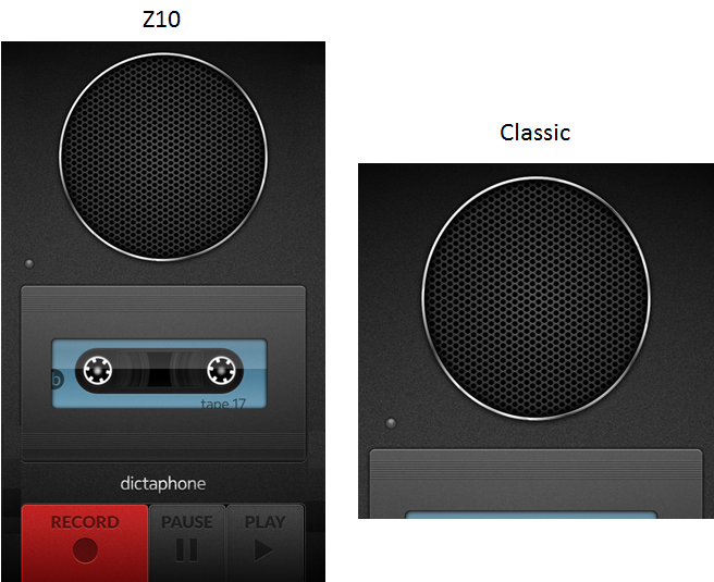
As you can see, the entire UI is visible on the Z10 while on the BlackBerry Classic about half the UX is cut off. You can of course access the entire UX by scrolling down on the display. However as a developer you might want to change the UX when going from a rectangular display to a square display so that you can see the entire UX without having to scroll. This is where asset selectors come into play. With asset selectors you can group a set of assets for a given display shape or size. Cascades will select the correct asset for that device. Check out this post on how to use asset selection to bring your app to a square device such as the BlackBerry Classic.
Coding for Classic Navigation Keys and Trackpad
If you follow the principles outlined above with regard to handling multiple resolutions you are already part way there in terms of bringing your app to BlackBerry Classic. The last thing you need to worry about is handling the trackpad and the navigation keys. The navigation keys are the keys to the left and right of the trackpad – the call and menu keys are to the left and the back and end keys are to the right. We provide you with the ability to receive navigation key evens as well as to customize the navigation keys. That being said, we strongly recommend not customizing the navigation keys unless you have a really good reason to do so. Our customers expect the navigation keys to function a certain way and overloading them with different functionality might be confusing and possibly evening annoying.
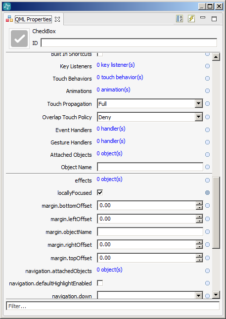
In contrast trackpad input and highlighting is something you may need to customize. Even though Cascades tries it’s best to provide default trackpad handling for your app, the reality is that every app is unique and the default Cascades behavior may not work for your app. Lets consider something like focus. A control gets focus when you hover over it with the trackpad. If I slide my finger downwards on the trackpad, focus moves to the next control and so on. By default when your app is launched Cascades will apply focus on the first focusable control. However this may not always make sense in the context of your app. For instance you might be writing a camera app and the “Effects”control might be highlighted by default when the app starts up. However you might want the “take picture” control to be highlighted instead. Cascades provides the facility to apply focus to a different control at app launch – you can do this by setting the locallyfocused property to true. You can configure this by checking the locallyfocused checkbox via the QML Properties view in Momentics or by making the edits directly in your qml source file.
One thing to keep in mind is that not all Cascades controls get focus by default. These include containers, labels, and images. This is because these are read only controls for which a focus paradigm does not make sense. The one exception is when these controls are added as list items – in this scenario they will be highlighted when that list item is selected. Either way irrespective of whether a control can or cannot get highlighted, you can override this behavior in Cascades by setting navigation.focusPolicy to Focusable or NotFocusable.
The other cool thing you can do in your app is change the trackpad navigation path. The following section in our developer docs illustrates how this can be done. If you decide to change the navigation path, make sure that you do this in such a way that it makes logical sense for the end user. The last thing you want is for the focus to move around unexpectedly and in an unpredictable manner.
Our support for trackpad goes beyond just enabling focus and changing focus path. Cascades also provides the ability to add custom highlighting to your control when it gets focus. In many cases you might be faced with a situation where the default highlighting on a control doesn’t look right. For instance the colour of your control might not mix well with the highlight colour resulting in a visually jarring experience. We provide several mechanisms for addressing this such as changing background colours, changing the highlight property or adding an effect .
Implications on Core Native
So far I have spoken a fair bit about Cascades but haven’t really touched on core native developers who might have existing content to port over and want access to trackpad events. Trackpad functionality is also available in core native via libScreen. The input from the trackpad comes in as a JOYSTICK screen event. Joystick events include both the displacement and the position of the joystick. Joystick events also work on the simulator so you can try it out to get a sense of how it works. We don’t provide access to built in UX controls at the core native layer so things like custom highlighting and focus do not really apply. If you do happen to have a core native app that supports a custom UX and need to support highlighting or focus, you would need to implement these features yourself. We also support the ability to intercept navigation key events at the BPS layer. The menu key can be intercepted as a screen event and the rest of the buttons can be intercepted via the navigator module.
As a developer I find that the best way I learn is by looking at actual code samples. This way I can compile a sample, try it on the simulator and play around with the code. We have several samples that highlight some of the topics I’ve covered here. You can find them at https://developer.blackberry.com/native/sampleapps. Two samples that I would like to call out specifically are the Belt sample and Highlighter. The Belt sample demonstrates how to intercept and respond to trackpad and navigation key presses while Highlighter sample demonstrates how to include and customize highlighting in your app.
Wrap-Up
In this post, I have tried to provide a high level map of the things you need to consider when porting your app over to BlackBerry Classic. It should be seen a starting point as opposed to a full blown tutorial. I have tried to point out the main challenges you might encounter and how you can address them and some useful links you can access for further reading. At the end of the day every app is different – for some, your app might port over with minimal effort. This would be especially true if you have an app that already works well on our existing rectangular and square displays and uses no custom controls. Those of you writing more complicated apps with custom controls might encounter more challenges. Either way, I hope you have found this article helpful and hope to see your app in BlackBerry World at launch!