The BlackBerry 10.2 SDK comes with new APIs that give you many more customization options. In a previous blog post, I shed light on the new FontFaceRule API that allows you to use custom fonts. In this blog post, I will focus on the much awaited CustomListItem API.
Up until the release of the 10.2 SDK, you had two options to define list items (ListItemComponent) of your list views (ListView).
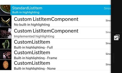
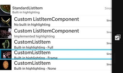
The StandardListItem API, which as the name suggests, is a basic template for displaying list items in a standard way with a title, description, status and image.
ListItemComponent {
    type: "item1"
    StandardListItem {
        title: ListItemData.text
        description: ListItemData.description
        status: ListItemData.status
        imageSource: "images/" + ListItemData.image
        contextActions: [
            ActionSet {
            }
        ]
     }
}
Or, if the design of your app requires any customization to the list items beyond what is available by the StandardListItem, through defining the UI controls and their layout directly inside the ListItemComponent.
ListItemComponent {
    type: "item2"
    Container {
        id: itemRoot
        layout: DockLayout {
        }
        Container {
            layout: StackLayout {
                orientation: LayoutOrientation.LeftToRight
            }
            verticalAlignment: VerticalAlignment.Fill
            rightPadding: 20
            ImageView {
                id: iconImage
                verticalAlignment: VerticalAlignment.Center
                imageSource: "images/" + ListItemData.image
                minHeight: 120
                minWidth: 120
                maxHeight: 120
                maxWidth: 120
            }
            Container {
                verticalAlignment: VerticalAlignment.Center
                leftPadding: 20
                Container {
                    layout: StackLayout {
                        orientation: LayoutOrientation.LeftToRight
                    }
                    Label {
                        layoutProperties: StackLayoutProperties {
                            spaceQuota: 1
                        }
                        id: titleLabel
                        text: ListItemData.text
                        textStyle.fontSize: FontSize.XLarge
                    }
                    Label {
                        id: statusLabel
                        text: ListItemData.status
                        verticalAlignment: VerticalAlignment.Bottom
                        textStyle.textAlign: TextAlign.Right
                        textStyle.fontSize: FontSize.XSmall
                    }
                }
                Label {
                    id: descriptionLabel
                    text: ListItemData.description
                    topMargin: 0
                    bottomMargin: 0
                    textStyle.fontSize: FontSize.Medium
                }
            }
        }
        contextActions: [
            ActionSet {
            }
        ]
    }
}
Figure a – No highlighting (code provided above)
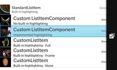
Figure b – Highlighting implemented (code not shown)
Even though the StandardListItem doesn’t allow for a lot of visual customization, it provides a smooth built-in highlight behavior on user selection or long-press that gives you a nice effortless user interaction edge that follows the BlackBerry 10 UI guidelines on highlight behavior. For custom list items, however, you have to implement this charming highlight behavior yourself with a few extra lines of code.
To provide further consistency to the BlackBerry 10 user experience and simplify your code, we are introducing the CustomListItem API with the release of 10.2 SDK.
The API is an “empty template” that allows you to customize the visuals of your list items through the simple single-line property setting approach you are used to in QML. You can now:
- Specify the visual controls and visual layout of your list items under the content property.
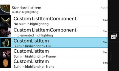
- Specify the list item highlighting behavior on user select and long-press using the highlightAppearance property. You can set the HighlightAppearance to None, Frame or Full.
- Show/hide a divider using the dividerVisible property to give visual separation between list items.
ListItemComponent {
    type: "item3"
    CustomListItem {
        dividerVisible: true //or false
        highlightAppearance: HighlightAppearance.Full //Frame,None
        content: [
        …
        ]
    }
}
ListItemComponent {
    type: "item3"
    CustomListItem {
        dividerVisible: true //or false
        highlightAppearance: HighlightAppearance.Frame
        content: [
        …
        ]
    }
}
ListItemComponent {
    type: "item3"
    CustomListItem {
        dividerVisible: true //or false
        highlightAppearance: HighlightAppearance.None
        content: [
        …
        ]
    }
}

If you had to implement your own selection highlighting logic for your custom list items before, then you too will definitely see this API as a welcome addition to our set of native API’s.
I encourage you to try it out. It’s easy to use and well-documented. And above all, it allows you to give the BlackBerry 10 user the same look and feel they have come to expect from using the BlackBerry 10 core applications.
Let me know if you have any questions or comments in the comments’ section below or on @SamarAbdelsayed. I will be happy to answer them for you!