It can be challenging to develop an application for different form factors without separating pieces of code to handle different screen sizes and pixel densities. Addressing the need for UI adaptability – and making form factor variations less of a challenge – has been one of the main goals for the Cascades UI framework in the 10.3 beta release.
However, there is more to 10.3 than just UI adaptability features. We also enhanced the Momentics IDE with the new 2.1 release, which brings workflow and UX improvements to the table. And to top it off, we also added several new audio-specific APIs in this beta, with more to come in our 10.3 Gold release.
Below are a few of the important new features that come with this beta release. These features will make life easier for you as a developer, which will result in a better experience for your users.
Design Units
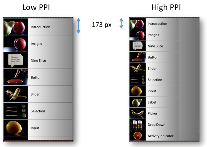
The problem we sought to address is simple to understand: if you use pixels as the unit when positioning and defining sizes of UI elements in a layout, the UI will look different on devices that have different pixel densities. The picture below illustrates this problem.
In the implementation of the list layouts in this example, the item height is set to 173 pixels. When displayed on a low PPI screen (left), the item becomes physically larger compared to the high PPI screen (right).
If you use Design Units (DU) instead of pixels to define the list items in this example, the result would be like in the picture below:
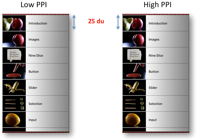
So, what is the exact relation between DUs, pixels and physical measurement? On the Z10, one DU equals 10 pixels, and on a Z30, one DU equals 8 pixels. When comparing one device with another, the physical size of one DU is approximately (but not exactly) the same size.
This is how you would use DUs in your code:
Container { preferredWidth: ui.du(25.3)
preferredHeight: ui.du(6)
background: Color.Red
}
“Buckets” and Selectors
Selectors and Resolution Buckets
Depending on pixel density, different devices belong to different “resolution buckets” (which we also sometimes refer to as “design buckets”). The Z10 belongs to bucket 10 (since it has 10 pixels per DU) and Z30 belongs to bucket 8 (with 8 pixels per DU).
There is a new asset selector feature that makes it possible to provide different assets for different resolution buckets. So similar to how you have been using a folder structure in your project to provide different assets for different resolutions, themes, etc., you would now provide (image) assets using a folder structure that could look like this:
assets
├─ 10ppd (Z10)
├─ 9ppd (Q10/Q5)
└─ 8ppd (Z30)
Automatic Image Scaling
If a device belongs to a resolution bucket for which you have not provided an optimized image, Cascades will take the asset in the closest (higher) bucket and scale it.
This can be a very convenient feature to use for many of your assets. Simply provide one single high resolution asset, and for all other buckets, Cascades will scale it for you.
assets
└─ 16ppd (all)
Selectors and Layout Buckets
With 10.3, Cascades offers a better way to handle alternative layouts for devices with different form factors. While the Resolution Bucket is the technique for different (density dependent) image assets, “Layout Buckets” is the new way to provide device, or more correctly, screen size-dependent layout implementations. This is the syntax for naming the layout assets folders:
min(d)?((w|h)[0-9]+|w[0-9]+h[0-9]+)du
w -> width
h -> height
d -> display dimension (optional)
And this is a more concrete example of how you could name your folders, when you would want separate implementations for devices with large (tall) or small (short) screens:
assets
├─ mindw76h128du (Z10,Z30)
└─ mindw80h80du (Q10/5)
Brand Colors
We all want our own application to stand out from other apps. And perhaps you have a brand color that you want to use across your application. So instead of just using the predefined blue accent color that comes with the dark and light themes, with 10.3 you can choose any color for the Cascades UI controls used in your app.

The implementation of the Cascades UI controls rely on a palette of colors, or color types to be more specific. Using a simple UI example, the image below shows what the different types in this color palette are:
As a developer, you don’t manually define all the colors in this palette. Instead, you define a primaryColor, and optionally the primaryBase. The different types in the color palette are generated by Cascades.
Many developers can just set the brand color (the primaryColor and primaryBase) and then simply verify the result, without having to pay attention to the individual color palette items.
But in the case where you have implemented custom controls, and you want these to adjust the appearance when a brand color is applied, you can access the colorPalette and use it in your implementation.
Audio & Media APIs
On the API front, we’ve added several new native APIs to supplement our current audio offerings.
First, we’ve added in support for OpenMAX AL. OpenMAX is a royalty-free open standard for providing access to codecs and presentation audio, video and images. For a full overview OpenMAX spec, feel free to browse OpenMAX on the Khronos website.
Please be aware that we do not implement all of the mandatory interfaces as noted by the specification, and in certain cases we have added our own extensions – particularly pertaining to buffer queue IO usage. Our current implementation of OpenMAX provides support for audio and voice recording and decoding. In a later release we plan to add support for video encoding.
Along with OpenMAX, we are providing access to our ProVoice API. ProVoice encapsulates a set of audio interfaces and codecs that allow you to add high quality full duplex audio support in your applications – the type of high quality audio that you can find in our BBM application, for example. If you’re building VoIP apps or apps that would benefit from full duplex audio, you should definitely consider incorporating this technology.
Tooling Improvements: Introducing Momentics IDE 2.1
You might wonder why you need to download this new version if you’re perfectly happy with Momentics 2.0.
There are two reasons you will want to upgrade. The first is so that you can move to the 10.3 API level and use some of our new and exciting Cascades features and core APIs. We don’t support the latest 10.3 API level in Momentics 2.0 (and earlier), so you’ll want to upgrade to the new IDE to take advantage of all the new features.
Second, the new IDE includes some valuable workflow improvements that you might find useful when developing your apps. Let’s take a closer look at some of the new features with this 2.1 beta release.
64-bit Installers
The first thing you’ll notice when installing Momentics 2.1 is that you now have the option to select the native 64-bit installers.
Note that this does not mean you can write 64-bit applications on the device or that BlackBerry 10 is now a 64-bit OS – all it means is that the IDE is now supported natively on the 64-bit desktop OS that you’ve installed it on (Windows, Mac or Linux). We continue to support 32-bit versions.
Updated Toolbar
You’ll also notice that we changed the toolbar. The old toolbar focused on projects as the starting point for the debug, run, profile configurations. The new toolbar focuses on launch configurations. Here’s a snapshot of the new toolbar:
Each time you create a project, Momentics creates a corresponding launch configuration in your workspace.
- Build: Builds the selected configuration
- Launch: Allows you to launch the configuration on the selected target (device or simulator)
- Stop: Stops the build
- Launch mode: Provides a drop-down of various launch modes you can run from the toolbar including run, debug, profile, code coverage, etc.
- Launch configuration: Lists the configuration for each project
- Launch target: Allows you to specify the device or simulator target you can launch your project on
New Card Templates and Card Debugging
For more advanced users, we added support for card templates and card debugging. One of the challenges when developing invokable cards is that there were no templates provided for creating a card, nor was it that easy to debug one. We addressed this with the new card templates that allow you to create a card app with a UI component.
The IDE also provides better support for triggering and debugging cards. You can now launch a card from the IDE, attach to it and set breakpoints as you would with a regular app. This workflow has been simplified, so debugging cards should be much easier.
QML Previewer Enhancements
If you’re working with design units, you’ll be interested in the support we added for design units in the QML properties view.
The QML previewer also has some enhancements to make testing easier. For instance, in the preview window you can use the touch interaction feature to test how your app responds to touch events, or use the selection feature to find the code that implements a control. You can also easily see how your UI looks with custom brand colors, themes and screen resolutions.
A few notes about upgrading the Momentics IDE
There are two ways you can upgrade your IDE. The first is via the traditional method of downloading the installers on our Downloads page. The second way is via the IDE itself. First you need to grab the URL of the update site via the Downloads page. Once you have this URL, manually enter this in Momentics as you would when installing any other Eclipse plug-in. Then you’re ready to go!
But wait – there’s more…
There is of course more to the release than the features that we described. For example, on the UI side, a new grid layout as well as APIs for list rearrange.
We also added some NFC, telephony and PIM APIs along with other enhancements to the tooling such as support for pretty printers and a new device properties wizard.
We recommend checking out the Release Notes to get a full walkthrough of all the new features, known issues, and fixed issues.
… and there’s even more to come!
Stay posted for our upcoming 10.3 Gold release, which will offer even more API and tooling additions. You can get a sneak preview of what we’re planning for the Gold release by checking out our roadmap.
As always, please refer to our developer site to access detailed documentation, API guides and samples as well as to download our tools. Have fun with the beta!