Guest post by Ekkehard Gentz, BlackBerry Elite Developer
This is part two of my series, “Secrets of the BlackBerry Jam Asia Conference App.” In part one, I demonstrated how to display an end-user license agreement when users first open an application.
In this post, I will go over creating a custom credentials dialog. There is already a SystemCredentialsPrompt for Cascades, but there were situations where the password field was not masked, so I developed a Custom Credentials Dialog for users to log in to the BBJam Asia Conference App.
BBJam Asia Login
There are different use cases to do a login. For the BBJam Asia Conference App, logging in is optional. Everyone can use the app and take a look at sessions, speakers, the venue and more. However, to get access to personal schedule, bookmark sessions as favorites or fill out surveys, users must be logged in.
To log in, users need a username and password. Users should also be able to easily request a new password directly from Login Dialog. Login credentials are sent to a server, and feedback if the Login was successful or not comes back asynchron.
If you’re looking to implement a Login to start your app, you can implement your Login logic similar to the EULA license dialog. I have extracted the code to do a Custom Login into a sample app. It is now available at Github (Apache 2 License).
I also recommend downloading the BBJam Asia Conference App to see it in action!
UI (QML)
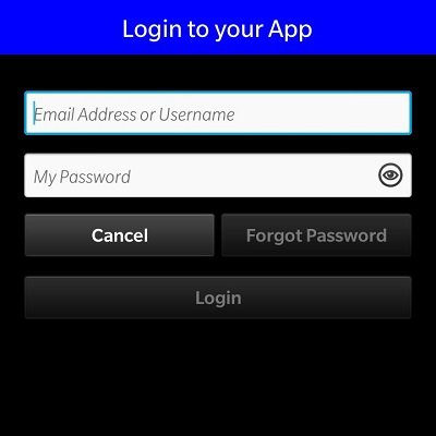
To start, we need a Dialog with a Title, two entry fields and some Buttons. To solve this the easiest way, we create a Custom Dialog with alias properties to get the values from fields and a result string.
Dialog {id: loginDialogproperty string resultproperty alias usernameEntry: usernameField.textproperty alias passwordEntry: passwordField.text
The Dialog gets a Container with a solid background color, so nothing will shine through. The color depends on the Theme:
Container {id: dialogContainerbackground: isDark() ? Color.Black : Color.WhitehorizontalAlignment: HorizontalAlignment.FillverticalAlignment: VerticalAlignment.Fill
To detect the Theme we use a function:
functionisDark() {returnApplication.themeSupport.theme.colorTheme.style == VisualStyle.Dark}
Inside the Dialog Container we have a Container for the Title and some Containers for the content to display the entry fields and Buttons.
The Title Container in the sample app has a blue background – the conference app uses the special JAM color. We use a fixed height for the Title and a white Label.
Here’s the Title Container:
Container {id: titleContainerbackground: Color.BluetopPadding: 5horizontalAlignment: HorizontalAlignment.FillverticalAlignment: VerticalAlignment.FillminHeight: 90maxHeight: 90Label {text: "Login to your App"textStyle.base: SystemDefaults.TextStyles.TitleTexttextStyle.color: Color.WhitehorizontalAlignment: HorizontalAlignment.CenterverticalAlignment: VerticalAlignment.CentertranslationY: 14}}
In your application, all text values like “Login to …” should be translated values qsTr(“Login to …”).
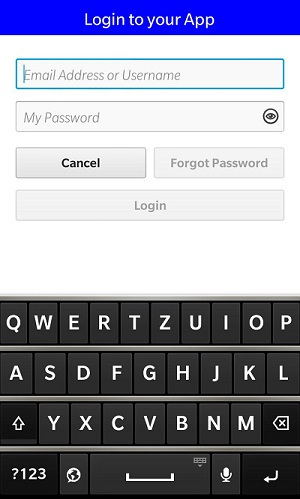
The Content is placed inside a ScrollView, so it also works if you’re using a Touch Device in Landscape mode with only 768 (Z10) or 720 (Z30) height and virtual keyboard. The Content Container (id: body) has some padding values – you can adjust them if you want to redesign the layout.
Inside the Container there are the two entry fields for Username (id: usernamefield) and Password (id: passwordField). Remember that we have access to the values from the Dialog alias properties.
TextField {id: usernameFieldhintText: qsTr("Email Address or Username")text: ""onTextChanging: {loginButton.enabled = passwordField.text.length > 0 && text.length > 0forgotButton.enabled = text.length > 0}inputMode: TextFieldInputMode.Url}TextField {id: passwordFieldhintText: "My Password"topMargin: 30text: ""onTextChanging: {loginButton.enabled = usernameField.text.length > 0 && text.length > 0}onTextChanged: {loginButton.requestFocus()}inputMode: TextFieldInputMode.Password}
There’s some UI-logic implemented:
- Login Button is only enabled if there are values entered for Username and Password
- Forgot Password Button is only enabled if there’s a value entered for Username
So we’re watching the slot onTextChanging{}: if text is eneterd we enable / disable the buttons.
Both textFields have a different inputMode: Url for Username and Password for PasswordField.
Also the second field (PasswordField) watches onTextChanged{}. This event happens if the user enters all the characters and hits the RETURN key.
The Buttons send different results back – here’s the Login Button:
Button {id: loginButtonenabled: falsetext: qsTr("Login")preferredWidth: InfinityfocusPolicy: FocusPolicy.KeyAndTouchonClicked: {loginDialog.result = "LOGIN"loginDialog.close()}}
Per default, the button is disabled. If clicked, the result is set to LOGIN and the Dialog will close.
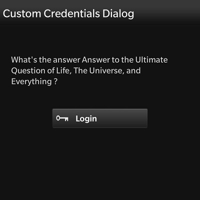
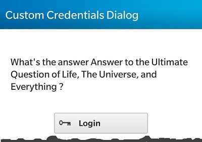
Here’s the LoginDialog from dark Theme on Q10 and light Theme on Z10 using different backgrounds:
The logic to show the Dialog is inside the
assets/main.qml
which is a TabbedPane in ConferenceApp and a simple Page in the sample App.
At first, we have to add the Custom Dialog as an attachedObject. Here you also see what happens, if the Dialog was closed. We test for the result and call a method from C++: app.login(…) or app.forgotPassword(…) using the entered values as parameters.
attachedObjects: [LoginDialog {id: myLoginDialogonClosed: {if(myLoginDialog.result == "LOGIN") {console.log("LOGIN");app.login(myLoginDialog.usernameEntry, myLoginDialog.passwordEntry);myLoginDialog.usernameEntry = ""myLoginDialog.passwordEntry = ""return}if(myLoginDialog.result == "FORGOT") {console.log("FORGOT PASSWORD");app.forgotPassword(myLoginDialog.usernameEntry)myLoginDialog.passwordEntry = ""return}console.log("CANCEL LOGIN");myLoginDialog.usernameEntry = ""myLoginDialog.passwordEntry = ""}},SystemToast {id: mailSentToastbody: "Mail send to request a new Password."}]
There’s also a SystemToast to send a notification to the user that a new password was requested. To open the Dialog we’re using a Button:
Button {id: loginButtonvisible: ! rootPage.loginDonetext: qsTr(" Login") + Retranslate.onLanguageChangedimageSource: "asset:///images/buttons/login.png"horizontalAlignment: HorizontalAlignment.CenterverticalAlignment: VerticalAlignment.CenteronClicked: {myLoginDialog.open();}}
If the Button was clicked, we open the LoginDialog.
Our Application should work on devices with light theme (Q5, Z10) and dark theme (Q10, Z30), so we need the login.png for both.
Cascades uses static asset selectors for this:
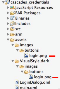
As you can see there are two login.png. Here’s how it looks from Q10 and Z10:
To receive the signals from C++ we have to connect to them:
functiononLoginDone(success) {if(success) {rootPage.loginDone = truereturn}// send toast to user that login failed}functiononMailSent(){mailSentToast.show()}onCreationCompleted: {// we have to wait for the signal that login was doneapp.loginDone.connect(onLoginDone)app.mailSent.connect(onMailSent);}
The secret to connecting them is done inside the onCreationCompleted{}: we connect the signals loginDone() and maiSent() from the C++ Application (app) and call a corresponding function. If login was completed successfully, we set a property, which makes another label visible. If a new password was requested, we show the SystemToast.
Business Logic (C++)
Now let’s see what happens at C++ side. We need the ‘app’ context property:
// access to the Applicationqml->setContextProperty("app", this);
Setting the context property isn’t enough – we must tell Qt that some of our methods can be invoked. This is done in the applicationUi.hpp Headerfile:
Q_INVOKABLEvoidforgotPassword(constQString& email);Q_INVOKABLEvoidlogin(constQString& user, constQString& pw);
We’re also sending some signals:
signals:voidloginDone(constbool& success);voidmailSent();
Remember: we connected to these signals from main.qml.
Here’s the implementation of the Q_INVOKABLE methods:
voidApplicationUI::forgotPassword(constQString& email) {qDebug() << "CASCADES CREDENTIALS | ApplicationUI::forgotPassword | email address: "<< email;// send the information to the server// or send an email to admin// let user know that password was requestedemit mailSent();}voidApplicationUI::login(constQString& user, constQString& pw) {qDebug() << "CASCADES CREDENTIALS | ApplicationUI::login for user: "<< user;// test if login OK or call server// in this app all logins are OKemit loginDone(true);}
Signals must NOT be implemented: using emit loginDone(true) sends them out to all connected to this signal, which can be from C++ and/or QML. Emitting these signals gets the function onLoginDone() called in main.qml.
This is only a sample app; it’s up to you to verify if the username and password are valid. This can be done by checking a local database or calling a server. If you want to store the username and password, you should use QSettings. I explained the use of QSettings in part one of this series.
Lastly, don’t forget to import the bb.system libraries in QML to make the SystemToast run!
import bb.system 1.0Summary
From this sample, you have learned:
- How to create a Custom Credentials Dialog
- Enabling and disabling Buttons depending from text Input
- Using SystemToast in QML
- Using static asset selectors for Images to support dark and light themes
- Connecting QML functions to C++ Signals
Download and Discuss
The Sample APP is available at GitHub Open Source (Apache 2 License). I also created a thread in the Forums, where you can ask questions or discuss this topic in more detail. Have fun creating your own custom credentials dialog!